Atomic components
Buttons
Buttons are used to initiate actions in your app. This may be a primary action, or it may be used to confirm an action in a dialog, or simply be used for any major action in your app.
There are generally different types of buttons for different purposes:

Primary buttons are used to indicate the main action (“Start call” button in Talk, “Move” in Files). The primary buttons are stylized in Nextcloud blue by default or the theming color when themed. These should only be used sparingly and ideally only for 1 visible action at a time.
Secondary buttons are used for actions that have lesser weight than the primary action (“Today” button in Calendar, “Copy” in Files)

Tertiary buttons, which are the buttons without a background, can be used for other actions in your app which are important, but not the main focus. These buttons are usually combined with a primary or secondary button. For example, “Mark as read” is a tertiary button used alongside a secondary button
The icon-only buttons can be used if the action is frequently used and the icon is easily recognizable, and therefore does not require any text to support it (mute/video/screenshare actions in Talk, and the 3-dot menu icon)

Success buttons are used for a positive action (“Join call” button in Talk)

Danger buttons are used to signify a potentially dangerous or negative action (“Remove account” button in the confirmation dialog when you want to remove an account in Mail, or “Delete conversation” in Talk conversation settings)
Action menu

The action menu contains commonly used actions associated with an item. Each entry in the action menu has some text accompanied by a suitable icon. In some cases, the action menu may also contain:

checkboxes to quickly toggle a state, like in Mail

radio buttons to select from a few options, like chat notifications in Talk

new entry elements to quickly add items, like add a new mailbox in Mail

a second level of actions, like due date reminders in Deck
Some commonly used actions in the action menu are favoriting, renaming, downloading and deleting. Delete should always be at the last position as to not be confused with other actions.
It is important to keep the action menu simple and its length at a minimum. Too many entries in the action menu can lead to confusion and people not finding what they are looking for.
In most cases the action menu is accessed through a 3-dot menu. In certain cases, it is better to use a specific icon instead of the generic 3-dot icon. For example in Talk a paperclip icon is used for accessing the action menu for attaching an item, and a heading icon is used in Text formatting bar for heading level selection.
For Android and iOS, the action menu is generally opened as a bottom sheet.
Input fields
Text input


Text inputs are usually used for free-form inputs. Make sure that the label for a text input field is simple and clear. It may also be a good idea to use placeholder text in the field.
Dropdowns

Dropdowns allow the user to select one or more items from a list. Dropdowns can have predefined options from which the user can select one or more items, as seen in Contacts for selecting the type of a phone number. If there are not too many entries, you may also think about using a set of Checkboxes and radio buttons instead.
Although not always necessary, it is generally a good idea to have a default item already selected, especially when a dropdown menu is a key element which will be used a lot. This can be decided by a number of factors such as most selected item for that user, most recently selected item, etc. For example, when you add a new phone number in Contacts, the type “Home” is automatically set in the dropdown.
Another variation of the dropdown allows the user to find their preferred option by typing it in, like in Mail where the “To” field in the composer allows you to type an email address, and as you type it shows a dropdown with the results matching the input. This kind of dropdown is useful for when there are many options and the user would already know what they are looking for. It can also be a good idea to allow new inputs if there are no matches.
Checkboxes and radio buttons


Checkboxes and radio buttons are very common input methods. They are most commonly used in the Action menu, Sidebar and Settings.
They should have a concise label, especially if they are inside an action menu. If more explanation is needed, you can also add a subline.
Pickers
Datetime picker

A user can quickly select dates, times and date ranges using the datetime picker. Use good default dates relevant to the task at hand. For example, in the case of setting an expiration date, unless the server has something enforced as default, 1 week is a good default.
Color picker

For certain elements of your UI you might want to allow people to set colors. This can easily be achieved using a color picker with some predefined colors. Be cautious about using different colors in the UI. In most Nextcloud apps like Deck and Calendar, user defined colors for UI elements are used sparingly and shown as a circle next to the element they refer to.
In addition to these 2 pickers, there is also the emoji picker and the timezone picker which can be also be used in your app.
Tags
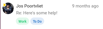
Tags are used by users to manage their items. They can be colored for easy identification, but make sure to use subtle colors if colored tags are a main part of the UI, as seen in Mail.
Modal

A modal is an element on top of the main UI, and interaction with the main element is disabled.
The modal is used when there is a specific task or information that the user needs to focus on. Modals are a good idea if the showing some information on the main UI would clutter the UI too much, and the information does not necessarily depend on the UI. Modals are also used for confirmation when performing dangerous tasks such as permanent deletion.
Examples of modals are:
Settings modal found in Talk and Mail
the modal view for a card in Deck
Move or copy dialog in Files
the file picker in Mail and Talk
On Android and iOS, content which is in a modal would usually be shown as a full-screen overlay, like for example composing a new mail in iOS Mail.
Avatar
An avatar is used when referring to any user and displays their photo or initials. The avatar component also shows a menu for that user when clicked.
When using an avatar it is usually accompanied by the name of the user as well, and sometimes it can also show the status of the user, although not always necessary. Statuses can be useful when the user is interacting with another user and is expecting a response, for example when @mentioning someone else in Talk, or in any sharing view.
When multiple people are working on or are assigned to the same element, like in Text, Office, a Deck card, or in the Files list for sharing, they are shown as overlapped.
Progress bars and meters

Progress bars shows progress for a potentially lengthy process such as uploading, downloading, or syncing. When using a progress bar it can also be a good idea to have a text-based indication of the progress, such as percentage or time remaining, and make sure to provide feedback when the process has been completed.

The progress bar component is also sometimes used as a meter to visualize data as seen in the settings for Files to show the quota.
User bubbles

When referring to a user inline in your app, a user bubble element can be used. In Talk and Comments, user bubbles are used in the content when someone mentions a user. In Mail, it is used in the header for the recipients of the message.
Tooltips

Tooltips are small elements which appear on hover and contain information about the element. Although not necessary for every action or item on the screen, tooltips are great for providing extra information or when an element is too small for the text contained in it.
Using many tooltips is not advised, and if your app does this, possibly consider instead using text labels for icons, reducing the number of actions, or if the info in the tooltip is needed at all.
Empty content

The empty content state provides feedback that a view is empty, e.g. a new folder. This is to differentiate it from the state of loading, or having loaded and showing data.
Make sure that empty content views only show when the view is really empty, and not while it is loading – otherwise people will be shocked as to where their data is gone. The wording on the empty content view should be friendly and helping people out of the situation, for example in the Bookmarks app.
Skeleton screens

While the app is loading, it is best to show a skeleton view of the apps probable contents as loading feedback. A good example for this is Talk on web as well as Files and Talk on Android.