Introduction
The navigation section of any Nextcloud app is the left sidebar. It is basically composed of
a primary action button
a menu
a settings area
The primary action button and the settings area are optional.
New button
Introduction
A primary action button is just a stylised button located above the navigation part of your app. The goal is to have an homogeneity of design across all apps using this button.
Basic layout
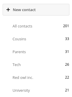
<div id="app-navigation">
    <div class="app-navigation-new">
        <button type="button" class="icon-add">
            Add user
        </button>
    </div>

    <!-- Your navigation here -->
    <!-- Your settings here -->

</div>
Rules
Stay simple, don’t use overcomplicated text in this button.
Avoid using sentences longer than one line.
Do not edit the styling of this button.
Only one button is allowed here.
App navigation menu
Introduction
The main navigation menu represents the main navigation of your app.
It needs to be:
Organised
Simple
Responsive
Nextcloud provides a very organized way of building menus. We implemented various essential functions and provide easy way of using them.
Basic layout
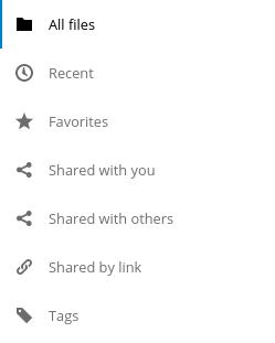
<div id="app-navigation">

    <!-- Your primary action button here -->

    <ul>
        <li><a href="#">First level entry</a></li>
        <li>
            <a href="#">First level container</a>
            <ul>
                <li><a href="#">Second level entry</a></li>
                <li><a href="#">Second level entry</a></li>
            </ul>
        </li>
    </ul>

    <!-- Your settings here -->

</div>
Basic rules
You can not change the default padding of the navigation elements.
We encourage you to add icons on every top-level item of your navigation for accessibility.
Do not override the default structure and/or CSS. Everything has been carefully tuned.
Utils: menu, counter & buttons
Each entry is allowed to have a counter and/or a button for user interaction.
The
app-navigation-entry-utilssnippet need to be placed right next to the main link of your entry.You can’t have more than two buttons, if you need more, you need to add a menu.
The order of the button and the counter are not interchangeable. You need to put the counter before the menu.
<div class="app-navigation-entry-utils">
    <ul>
        <li class="app-navigation-entry-utils-counter">1</li>
        <li class="app-navigation-entry-utils-menu-button">
            <button></button>
        </li>
    </ul>
</div>
Menu
If you need to add a few interactions for your entry, you can put everything in a popover menu.
The menu needs to be placed after the app-navigation-entry-utils.
For the global rules and/or layout, you can check the dedicated popover menu section.
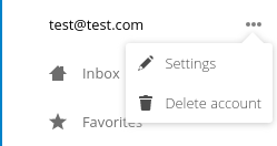
<div class="app-navigation-entry-menu">
    <ul>
        <li>
            <a href="#">
                <span class="icon-add"></span>
                <span>Add</span>
            </a>
        </li>
        <li>
            <a href="#">
                <span class="icon-rename"></span>
                <span>Edit</span>
            </a>
        </li>
        <li>
            <a href="#">
                <span class="icon-delete"></span>
                <span>Remove</span>
            </a>
        </li>
    </ul>
</div>
The menu is hidden by default and has to be triggered by adding the open class to the app-navigation-entry-menu div.
In case of AngularJS the following small directive can be added to handle all the display and click logic out of the box:
app.run(function ($document, $rootScope) {
    'use strict';
    $document.click(function (event) {
        $rootScope.$broadcast('documentClicked', event);
    });
});

app.directive('appNavigationEntryUtils', function () {
    'use strict';
    return {
        restrict: 'C',
        link: function (scope, elm) {
            var menu = elm.siblings('.app-navigation-entry-menu');
            var button = $(elm)
                .find('.app-navigation-entry-utils-menu-button button');

            button.click(function () {
                menu.toggleClass('open');
            });

            scope.$on('documentClicked', function (scope, event) {
                if (event.target !== button[0]) {
                    menu.removeClass('open');
                }
            });
        }
    };
});
Counter
If you need to add a counter to your menu entry, you can simply use this structure. Do not change the alignment of the text. If you’re using

<li class="app-navigation-entry-utils-counter">1</li>
The counter should be limited to 999 and turn to 999+ if any higher number is given. If AngularJS is used the following filter can be used to get the correct behavior:
app.filter('counterFormatter', function () {
    'use strict';
    return function (count) {
        if (count > 999) {
            return '999+';
        }
        return count;
    };
});
Use it like this:
<li class="app-navigation-entry-utils-counter">{{ count | counterFormatter }}</li>
Highlighted counter
The counter can also be highlighted to attract some focus, e.g. for unread chat messages

<li class="app-navigation-entry-utils-counter highlighted"><span>99+</span></li>
Buttons
The same way we display the menu three-dot-icon button, you’re allowed to use up to 2 buttons in a single entry.
The icon class goes directly on the
buttonelement.If no class is set, the three-dot-icon will be used by default

<div class="app-navigation-entry-utils">
    <ul>
        <li class="app-navigation-entry-utils-menu-button">
            <button class="icon-edit"></button>
        </li>
        <li class="app-navigation-entry-utils-menu-button">
            <button class="icon-delete"></button>
        </li>
    </ul>
</div>
Drag and drop
The class which should be applied to a first level element li that hosts or can host a second level is drag-and-drop. This will cause the hovered entry to slide down giving a visual hint that it can accept the dragged element. In case of jQuery UI’s droppable feature, the hoverClass option should be set to the drag-and-drop class.
<div id="app-navigation">
    <ul>
        <li><a href="#">First level entry</a></li>
        <li class="drag-and-drop">
            <a href="#" class="icon-folder">Folder name</a>
            <ul>
                <li><a href="#">Folder contents</a></li>
                <li><a href="#">Folder contents</a></li>
            </ul>
        </li>
    </ul>
</div>
Collapsible entry
By default, all sub-entries are shown. This behavior can be changed by creating a collapsible menu. This way, the menu will be hidden and an arrow will be added in in front of it (replacing the icon if any).
The opening of the menu is activated and animated by the class open on the main li.
You can not have a collapsible menu on a sub-item, this can only exist on a top-level element.
You can set the open class by default if you want.
Do not use the collapsible menu if your element does not have sub-items.
You still need to use JS to handle the click event.
Important
If your top-level link is only used as a header, the entire
aneeds to be used to toggle theopenclass.If your top-level link is used to redirect the user or to trigger something else, you need to add the collapsible button and use it as the
openclass toggle trigger.
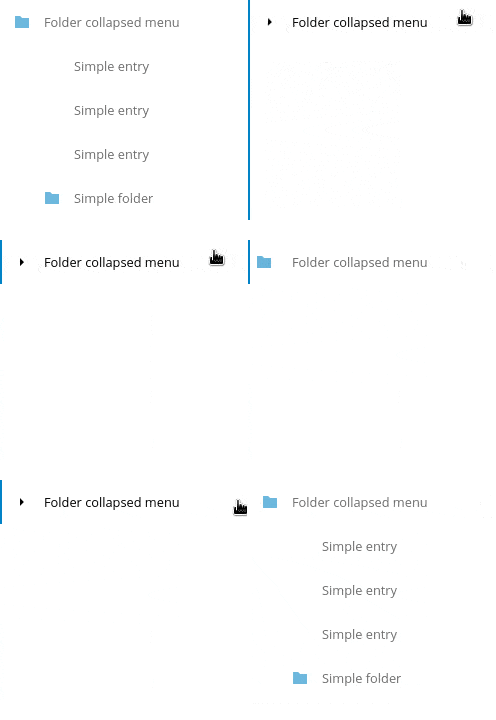
<li class="collapsible open">

    <!-- This is optional -->
    <button class="collapse"></button>

    <a href="#" class="icon-folder">Folder collapsed menu</a>
    <ul>
        <li><a href="#">Simple entry</a></li>
        <li><a href="#">Simple entry</a></li>
        <li><a href="#">Simple entry</a></li>
        <li>
            <a class="icon-folder" href="#">Simple folder</a>
        </li>
    </ul>
</li>
Entry bullet
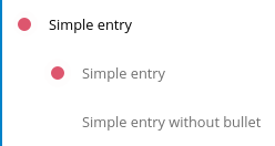
Every entry can have a colored marker in front of it. We call it a bullet.
You can not combine an icon with a bullet.
You need to use the CSS to define the bullet color.
<li>
    <div class="app-navigation-entry-bullet"></div>
    <a href="#">Entry with bullet</a>
</li>
Undo entry
Undo entries can be used on any level you want.
When an entry is deleted, please use the usual 7 seconds delay feedback before final deletion.
Please use the sentence Deleted XXXX as the feedback message.
You need to use the
deletedclass to trigger the animated hide/show of the undo entry.

<li class="deleted">
    <a href="#" class="hidden">Important entry</a>
    <div class="app-navigation-entry-utils">
        <ul>
            <li class="app-navigation-entry-utils-menu-button">
                <button class="icon-delete"></button>
            </li>
        </ul>
    </div>
    <div class="app-navigation-entry-deleted">
        <div class="app-navigation-entry-deleted-description">Deleted important entry</div>
        <button class="app-navigation-entry-deleted-button icon-history" title="Undo"></button>
    </div>
</li>
Edit entry
Editable entries can be used on any level you want.
You can replace the
formby adivif you wish to do your request with JS.You need to use the
editingclass to trigger the animated hide/show of the input.You’re allowed to use only one submit input. It must be the validation button.
The input must have the same value as the entry link text.

<li class="editing">
    <a href="#" class="icon-folder">Folder entry</a>
    <div class="app-navigation-entry-utils">
        <ul>
            <li class="app-navigation-entry-utils-menu-button">
                <button class="icon-rename"></button>
            </li>
        </ul>
    </div>
    <div class="app-navigation-entry-edit">
        <form>
            <input type="text" value="Folder entry">
            <input type="submit" value="" class="icon-close">
            <input type="submit" value="" class="icon-checkmark">
        </form>
    </div>
</li>
Pinned entry
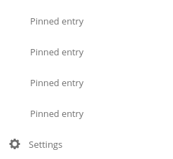
Every top-level entry can be pinned at the bottom.
All the pinned entries can be mixed between non-pinned entries.
All the pinned entries must have the
pinnedclass.The first pinned entry must also have the
first-pinnedclass.
<ul>
    <li><a href="#">Non-pinned entry</a></li>
    <li><a href="#">Non-pinned entry</a></li>
    <li class="pinned first-pinned">
        <a href="#">Pinned entry</a>
    </li>
    <li class="pinned"><a href="#">Pinned entry</a></li>
    <li><a href="#">Non-pinned entry</a></li>
    <li><a href="#">Non-pinned entry</a></li>
    <li class="pinned"><a href="#">Pinned entry</a></li>
    <li class="pinned"><a href="#">Pinned entry</a></li>
</ul>
Various information
You can add the
icon-loading-smallclass to anylielement to set it in a loading state.Every element as a
min-heightof 44px as that is the minimum recommended touch target. It also helps with clickability and separation on desktop environments.
Settings
Introduction
To create a settings area create a div with the id app-settings inside the app-navigation div.
The data attribute
data-apps-slide-toggleslides up a target area using a jQuery selector and hides the area if the user clicks outside of it.Max height of the settings area is 300px. Do not change that.
Keep it clear, organized and simple.
Basic layout

<div id="app-navigation">

    <!-- Your primary action button here -->
    <!-- Your navigation here -->

    <div id="app-settings">
        <div id="app-settings-header">
            <button class="settings-button"
                    data-apps-slide-toggle="#app-settings-content">
                Settings
            </button>
        </div>
        <div id="app-settings-content">
            <!-- Your settings content here -->
        </div>
    </div>
</div>